Is there a more effective representative technique than illustration capable of depicting any visual concept? The answer is no.
As explained in a previous article: illustration is the visual representation normally used to clarify some aspect of the text or for decoration. In this article, however, we will focus on the use of illustration in the graphic design of packaging.
But, what is packaging?
Packaging is that section of marketing that carries out the study, design and production of packages capable of differentiating products and making them easily recognizable in the eyes of consumers.
When making a package, you need to take care of its visual appearance. In the graphic design phase of the packaging, it is important to identify the most suitable visual style to spread your message, communicate the brand and attract the attention of observers.
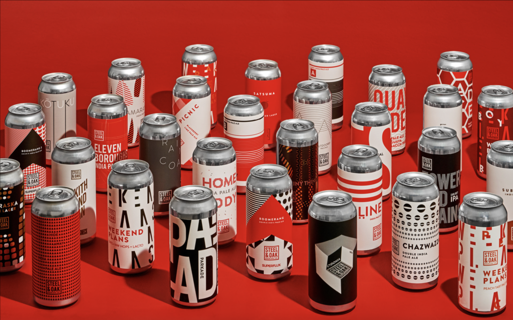
Very often the use of illustrations, created in such a way that they meet the communication and marketing requirements of a project, is essential to effectively convey a message, giving a strong personality to the product and at the same time strengthening the corporate identity.
They are therefore an excellent tool for positioning a product, it distinguishes it from the competition and increases its attractiveness; depending on the style chosen to convey the qualities of the product and the brand, they can effectively hit their target customers.
packaging Design & Illustration
Drawn and painted images embellish food packaging; think about it, even if the image is reproduced and printed in thousands of copies, the psychological effect of a painted drawing is still that of an image made in a unique and artisanal way by an artist.
A very important feature of the illustrations is that of being able to tell a world and a story through characters, subjects and styles. A story that can define the character of the product or brand, its ambitions and its way of dealing with its customers, in a serious and determined or fresh and fun way.
The packaging that I have selected as an example for this article, are characterized by the use of illustrations as a central and recurring graphic component.
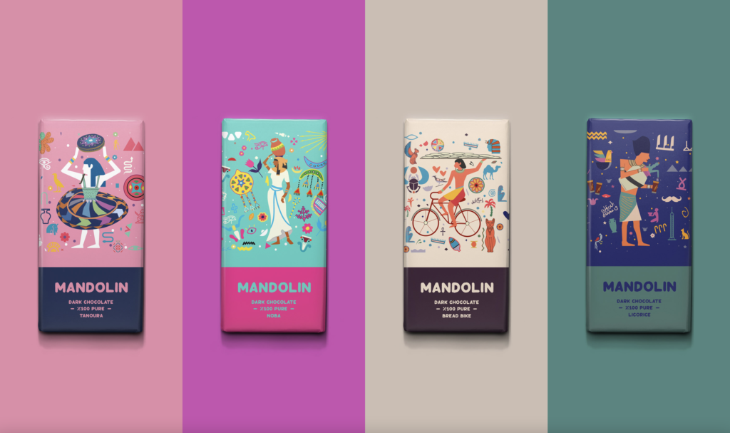
Concept by Dat Nguyen
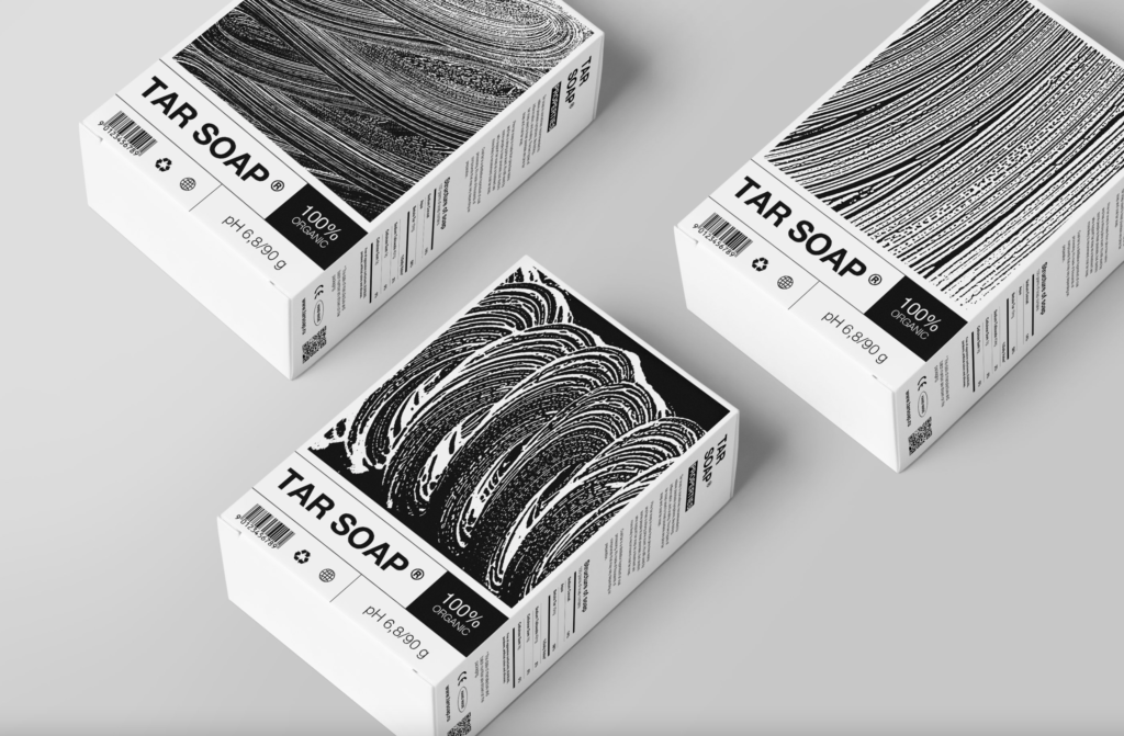
The packaging graphics for these soap packs were created using vectorized soap models.
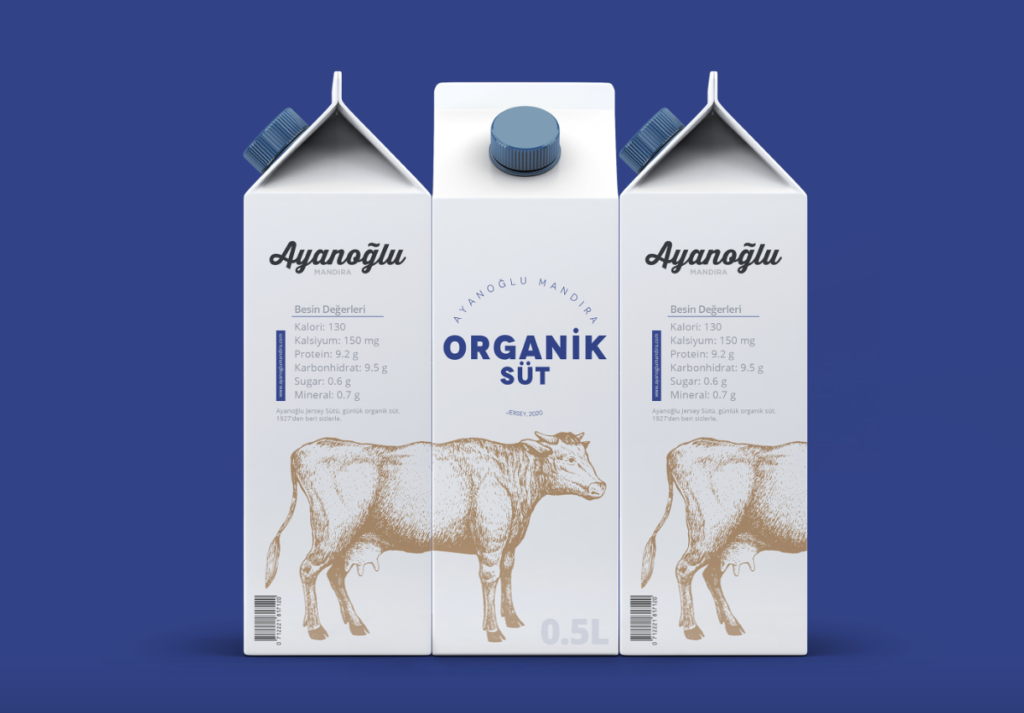
There are obviously various styles of drawing and painting that serve to define the type of message you want to give to the product and the brand: black and white styles, watercolors, vector drawings.
There are dozens and dozens of styles, and they differ greatly from each other; they tell different stories and different worlds, which is why it is very important to choose them in relation to the subject represented, and to create effective packaging.
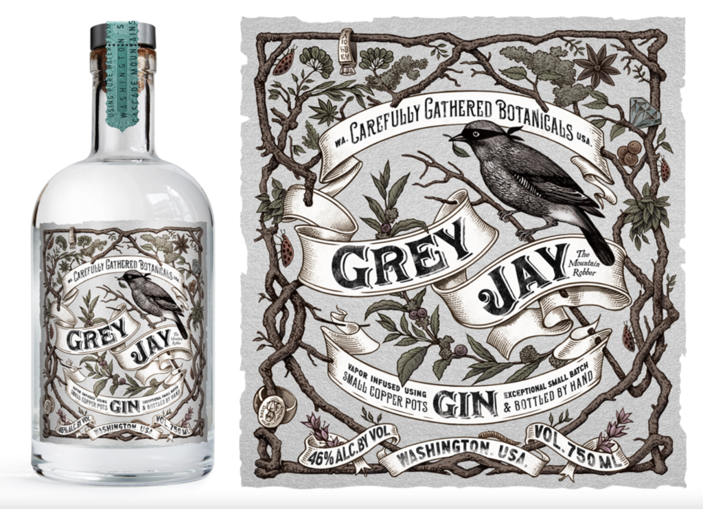
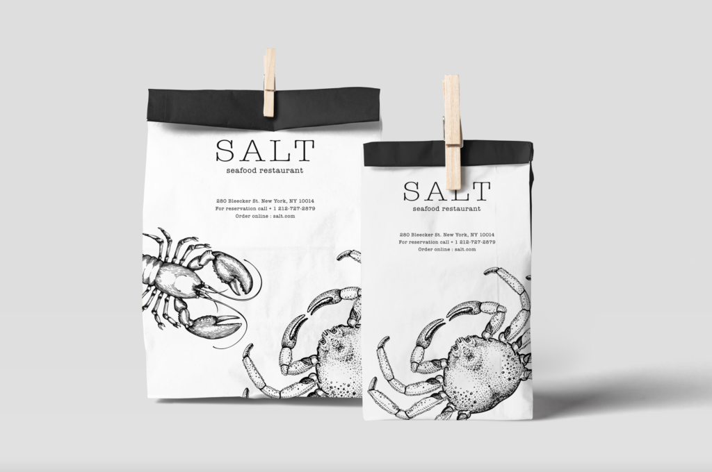
This packaging design is an example of how a simple, minimalist black and white illustration can make a product easy to recognize and stay in memory.
Conclusions
We interact with dozens of packaged products every day; we have seen how illustration has its strategic function, and how its role in packaging is designed to achieve specific marketing objectives. I hope I’ve awakened some inspiration with this short collection of examples ⭐️
If you liked this article, let me know in the comments below!
See you next time!
