You don’t judge a book by its cover.
How many times have you heard this phrase? But think about it: a book cover must be attractive in order for readers to be enticed and buy the book. How many times have you entered a bookstore and found a book in your hands that had caught your attention precisely because of the cover?
The colors, the typographical choices and the formats are real recognition codes designed to communicate with a target audience.
The design of the cover, in short, is a work phase that should not be underestimated.
This article is dedicated to all writers who do not have a lot of knowledge in the field of graphics and communication. Since the saying “ a book is not judged by its cover ” is not always valid, we will see some tips that you should keep in mind when designing a cover.
That said, let’s get started!
1. Search like that
Such research shows you what NOT to do.
As are the fonts and colors, the image is also imported.
Readers need to be able to look at a cover and understand whether it is a contemporary or a fictional novel. Whoever designs a book cover must therefore be aware of its content.
If you are the writers yourself and you are not the one who has to take care of the cover of your book, make sure you provide all the useful information about its content to those in charge:
– a brief summary of the plot;
– some significant excerpt;
– description of atmospheres, places and characters.
2. Design consistent with the author

If you are working with a new author, then you have the privilege of launching the brand, if otherwise you are working with an established author, you need to combine your design with the existing brand, especially if the books are written in the same genre.
Designing a cover that is consistent with the other books by the same author makes it easier for regular readers to recognize the same author. This helps increase sales for readers who have already read and loved the books by the author, but also attracts new readers who can recognize the covers in more places.
An example are the covers that Sperling & amp; Kupfer has launched Stephen King for reprinting.
3. Editing of the text
Lettering plays an important role.

In some covers, it even takes the place of images, as you can see in the example above of John Green’s Cercando Alaska edited by Rizzoli.
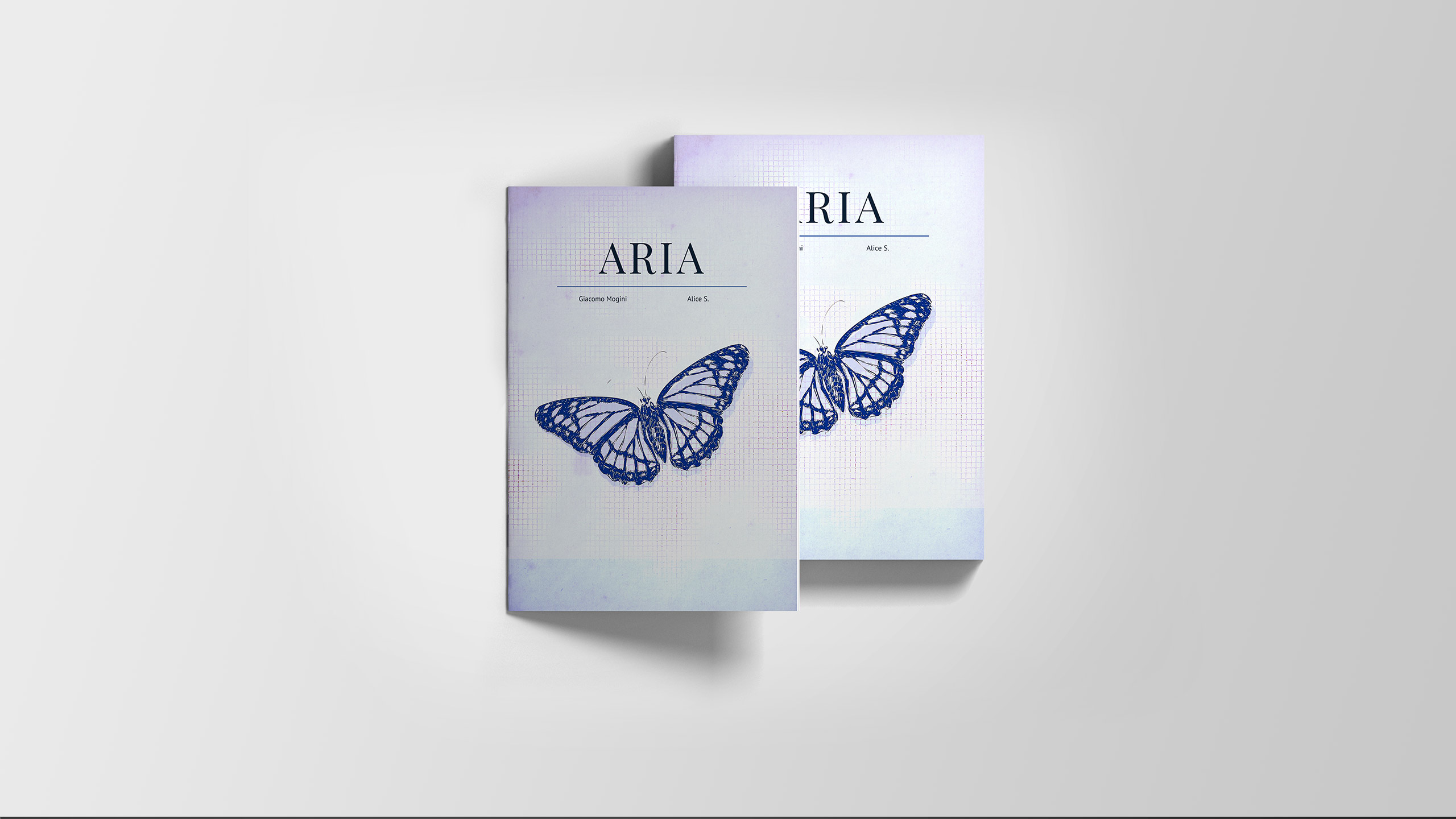
The hierarchy usually adopted in the design of a cover provides that the title is a little larger than the author’s name. A non-obligatory choice, but the important thing is to always make conscious choices.
What to avoid?
1. The use of free fonts which would risk conveying to the public that yours is a cheap book.
2. Fantasy effects such as shadows or shades, make the cover amateur. The text must be clean and legible.
3. Avoid using too many fonts. As a general rule, you shouldn’t use more than two characters when designing a book cover.
4. Choice of focal point
The cover design must focus on a single focal point in order to intrigue people who look at it. This element should best represent the plot of your book and ensure that it is understood even before it is read.
But be careful not to insert too many elements trying to make the cover more original, you only risk making it more distracting and unattractive.
5. Study a color palette
Creating your project by combining colors that have a good overall rendering can only enrich and make the cover pleasing to the eye and give it that extra particularity.
I suggest you the name of two sites that are very useful for choosing colors. I use them almost often in my projects, both graphic and illustrative:
6. Get inspired by other projects
Hey, I’m not saying copy!
Being inspired by observing the works of the most famous graphic designers and taking a cue for a particular combination of colors or an element used to refer to a very specific concept, is of great help for the development of ideas.
And please … be original!
Think about every detail of your book and an image that can refer to it. Use original photos or illustrations that you hardly see on bookshelves.
The example I am showing you is one of the most beautiful projects ever: the cover chosen by David Pelham, at the time art director of Penguin Books, for the 1972 edition of A Clocwork Orange (A Clockwork Orange ).

Conclusions
We have seen what are the fundamental points to keep in mind when designing a book cover, and the risks that are incurred by not appealing to the public for which the book was written.
Remember well: whether it is a photograph or an illustration it is important that the image intrigues, draws attention and triggers an emotion. Images don’t have to describe the text, they have to suggest it.
If you liked this article let me know in the comments!
Do you want to know more about the technique of making a book cover? Check out the article I wrote dedicated to redesign of a cover, you will find some design examples I have created for the restyling of three novels.
Until next time! 😉


